My group and I decided on the font and typography we will use for the title and the main text with cast names and production company. For the cast names and production companies we used the font Neuropol and that was also the top font in the questionnaire that I conducted.
For the main title typography, I did some research on the internet for spy fonts and I found a font called Spy Agency, that font can be seen here: http://www.dafont.com/spy-agency.font
My group and I decided we liked this font a lot and we will use it for our title. I will make the title on Photoshop and then put it into Final Cut Pro X.
Today I have started editing and I will soon hopefully complete the editing for the Final Title Sequence of Agent X. My group and I looked at various soundtracks and we decided to choose this one of our Opening Scene (Chase Scene).
I uploaded this chase scene soundtrack on YouTube and it was copyright free, so we decided used it for our final edit.
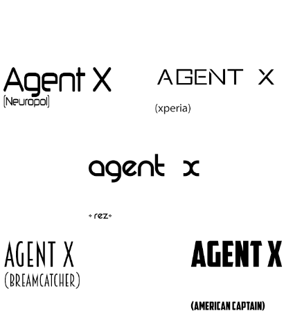
We have now completed the first edit but now we just need to find the right Typography and Font for the title and text throughout the title sequence. We have looked at various sites and sources to find these fonts such as DaFont.com and 100freefonts.com. The image shown below are some of the favourite fonts we preferred for the Spy/Action genre.
My Group and I have decided that "Xperia" and "Breamcatcher" is so far the best suited fonts but we change this when we create our final edit.
Today we have taken some Location shots and my group and I decided we were happy with our Location. These shots show the main locations we targeted for our title sequence such as the establishing shots. The location shots for our title sequence can be seen here:-
Typography plays an important role in title sequences, it changes the audience opinion about the film and it also tells the audience what genre the film is. Titles can be serif fonts and cast names can be sans-serif fonts so the audience sees the difference and acknowledges one over the other. Some typography can be bold with solid colours and shapes, this can be related to a Saul Bass style design of typography. Some typography in title sequences have movement and they also have transitions such as fade on screen and fade off screen.
Catch Me If You Can (2002, Steven Spielberg) Typography Analysis
The fonts used in Catch Me If You Can is very simplistic sans serif fonts. It is bolded and has a solid colour of black and white. This suits the theme of the sequence which is created in Saul Bass style so it has Shapes and Solid colours like black and white.
Monsters, Inc. (2001, Pete Docter, David Silverman, Lee Unkrich) Typography Analysis
The font in Monsters, Inc. is a serif font in the colour white, the font is sharp pointed and also bold giving a monster look which suits the name and narrative of the film.
The title font is also the same but it then changes into a serif font with a bold bright blue colour and a white outline. This font again, is a Monster type of font and its also child friendly showing this is a kids/family film.
Lokking at various typography's in films has shown me that typography plays a vital role in title sequences. It immediately causes the audience to judge the film and shows them what genre the film may be or even the target audience of the film. The typography must suit the film and its genre as well as suiting the design of the title sequence.
Insidious (2010, James Wan) Title Sequence Analysis
The cinematography in the title sequence are close ups and long shots of scary objects such as dolls and an alley way. The shots also have a black and white filter to give an eery feel to the audience and immediately you realise this is a horror film. There are many shots and they all have this black and white filter which can also give the audience the feel of an old film or even the idea that its night and there may be ghosts.
The lighting is very low on the shots, again to give a creepy and scary feel. They also used props like a grandfather clock and a photo of a family, all iconic pops in some horror films. The soundtrack used is a scary soundtrack again to relate to the genre of the film. The soundtrack suddenly starts to increase in volume giving a scary feel to the audience and then it suddenly stops which gives another scary feel of whats going to happen. The title sequence constantly puts the audience on the edge of their seats.
The typography is very sharpe and serif fonts in the colour red to symbolise blood and evil. The text also fades in and away like smoke symbolising a ghost. The transitions are simple and they are combined with the other shots. All the shots are very quick and cut together giving the audience a hint of what the film is about and that its mainly around a house and a little boys bedroom. I like this title sequence as it suits the genre very well along with all four of the elements.
Karin
Fong both a Director and Designer, was born in 1971 in USA. She
has won a Primetime Emmy,
and nominated 4 times for a Primetime Emmy and was also recently named one of
the top 100 most creative in business by Fast Company magazines. She began
her career with an art degree from Yale and then onto becoming an
animator on the WGBH TV program ‘Where in the world is CamenSandiego?’.
She
is now the founder and member of the Imaginary Forces, which is a production
and design company based in New York. Her
work has been shown at famous events such as the Cooper Hewitt
National Design Museum, the Pasadena Museum of California Art, The Wexner
Center, Artists Space, and the Walker Art Centre. She has worked with many famous films and title sequences such as :- Boardwalk Empire
Karin Fong only used CGI throughout her
title sequence for Daredevil (2003).
She uses bright and bold 3D fonts on a
dark background making sure it stands out. She also centers the text so the
audience look directly at it. The title sequence mentions the main
production companies first then the stars and that’s it.
It doesn’t
follow the normal tradition of title sequences such as the Production Company,
then director, then film name and after all that comes the stars and casts.
Fong also add various sound effects which
synchronize with
the actual scenes and footage, such as the sudden volume increase when the
Daredevil logo appears.
I think this title sequence was fairly
bland as it was all CGI and could be made better if it had some shots of actual
film scenes of Daredevil the character.
The Raid: Redemption (2011, Gareth Evans) Production Companies involved in this film were Merantau Films, Celluloid Dreams and XYZ Films.
Legend (2015, Brian Helgeland) The main Production Company involved in this film was Working Title Films.
I have seen both these acton films and they don't have an actual title sequence which mentions the cast and and the actors, it only says the main production company and the title of the film. This tells me independent films do not concentrate on creating title sequences as they try to attract their audience mainly from word of mouth and just show the film, they don't have interest in making the start of the film interesting for the audience, they want to overall make the film interesting and appealing rather then the title sequence and the credits.
Mainstream Blockbuster Spy/Action Title Sequence
Spectre (2015, Sam Mendes), The main Production Companies involved in this film were Columbia Picture, Eon Productions, Metro Goldwyn Mayer and Sony.
The above title sequence is from Spectre, it has Non-Diegetic sound which is very well synchronised with the scenes and the text. It also has various cinematic and shots making it look very high quality along with CGI such as the octopus. This instantly makes the film appealing and tells me that my film "Agent X" and its title sequence must be by a Mainstream Blockbuster Company as it must appeal the audience and look very high quality.
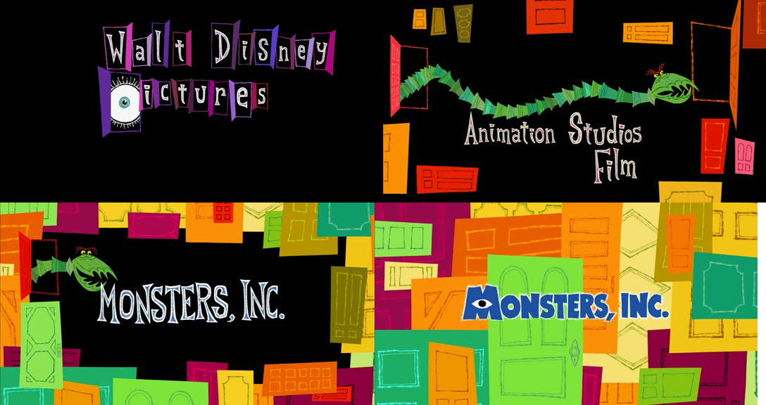
This article shows the development of the art of title sequences at the start of films. From the silents films in the 1900s to the modern films produced with technology. The article displays how over time the art of title sequence has constantly changed and improved, but that doesn't mean the old title sequences styles have been forgotten. "The concept of score visualisation first conceived by Oskar Fischinger in his film “Studies” anticipates the effects created by Saul Bass in “The Man With the Golden Arm” (1955) and later by Susan Bradley in “Monsters, Inc” (2001):" This quote from the article shows that the old title sequences are still being looked at and being considered. Susan Bradley in Monsters, Inc (2001) was inspired by the art of Saul Bass showing that even at modern times the old title sequence designs and ideas have not been forgotten.
(Monsters Inc, 2001)
(The Man With the Golden Arm, 1955)
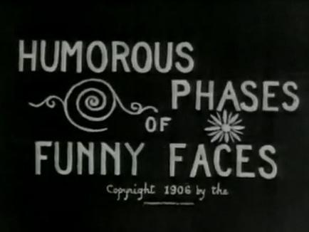
"“Humorous Phases of Funny Faces” (1906) was directed by J. Stuart Blackton, who many consider to be the father of American animation. Not only is it one of the first animated films, it is among the first to feature an animated opening title, making it a precursor of the modern title sequence" This quote shows how animated title sequences actually began. Many modern title sequences are animated especially when they are for an animated film. If it wasn't for J. Stuart Blackton many title sequences may not have been animated, J. Stuart Blackton started the era of using animation in title sequences.
Typography has been an important part of title sequences since the first title sequence ever created. Famous filmmakers such as Woody Allen strongly considered the typography in his title sequences. This quote from the article shows that Allen has a specific font he uses and prefers to use in his films. "Allen uses the Windsor font for most of his films". Woody allen also used his typography with "the very appearance of white-on-black title lettering". Even in modern films typography is strongly considered and is seen as a huge part of a title sequence. "For the end sequence of “Ratatouille”, Susan Bradley drew the typography, inspired by the slab-serif typeface. For the opening titles, she used a hand-drawn cursive intended to evoke Paris". Various films have certain types of typography which suit the genre. Some typography may be bold and some more simplistic depending on the film. The typography must look visually appealing and attract the audience.
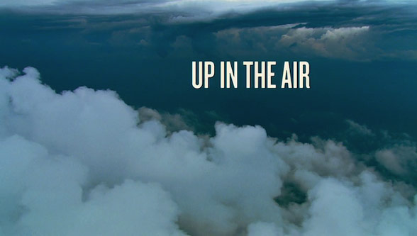
Some of the title sequences created strongly considered the camera shots used instead of just having an animated title sequence. "In the title sequence for “Up in the Air” (2009), the designers at Shadowplay Studios rely on aerial photography" This quote from the article shows that this title sequence consisted of aerial shots instead of an animated title sequence. Shadowily studios wanted to only use aerial shots in their opening scene of the film.
Graphic design has also been a huge part of title sequences in films. Mainly title sequences consider the use of graphic design to create title sequences. The famous graphic design style is of course by Saul Bass which has been used in many films. "The 2005 crime-comedy “Kiss Kiss Bang Bang”, designer Danny Yount made use of Saul Bass-style graphics to recreate the atmosphere of 1960s detective stories" and even Steven Spielbergs 'Catch Me If You Can' used graphic design inspired with a Saul Bass style.
Overall conclusion, the article linked at the start of this blog informs us of the great development in the art of title sequences. Title sequences are still developing and styles are still changing but the history of title sequences are still creating a huge impact on modern title sequences.
Saul Bass (1920-1996) is an American Graphic Designer who has also made many title sequences for films and some of them very famous title sequences making him a very famous title sequence designer.
He uses simple geometric shapes in his title sequences creating patterns and a very unique designs. His work has become his own style, the "Saul Bass Style". Bass was a freelance graphic designer but before this he worked in an apprenticeships with Manhattan design firms. Bass created posters which truly captured the mood of a film within simple shapes and colours. He used shapes and images in title sequences instead of just one photograph of a film star which most title sequences in the past had.
Bass hand drew the shapes and images for his title sequences. He uses these Geometric shapes in his title sequences and they all have symbolism of the film they were made for, theses images and shapes usually had a message that linked with the film and Bass made sure the audience recognises this message as well. His style was very distinctive and recognisable. He started making title sequences when he worked the filmmaker Otto Preminger where Bass made prints for the film adverts. Preminger admired Bass's work as asked Bass to create a title sequence for a film. Since then Bass has even worked with some great directors in the history of films such as Alfred Hitchcock, Stanley Kubrick and Martin Scorsese. Bass has made title sequences for films like "The Man With The Golden Arm", "North by North West", "Vertigo" and even the very famous film "Psycho".
His title sequences usually consists of bold block colours and shapes. Bass is commonly known for playing around with shapes, silhouettes and colours and this can be seen in his title sequences.
Title sequences used to just be images or text. Bass introduced using videos to tell a story in a title sequence instead of being a plain image or text. Since then title sequences now have videos not just an image or text.
If it wasn't for Bass creating title sequences in a stylish way and as a video, title sequences may never have been seen as a piece of art. Bass himself said“I want everything we do to be beautiful. I don’t give a damn whether the client understands that that’s worth anything, or that the client thinks it’s worth anything, or whether it is worth anything. It’s worth it to me. It’s the way i want to live my life. I want to make beautiful things, even if nobody cares.” This quote shows that Bass loves his work and he sees his art as Beauty, even if others do not.
'The Man With The Golden Arm' (1955, Otto Preminger) Title Sequence Analysis This title sequence is very simply designed with a constant black and white coloured them and block shapes throughout the title sequence. Throughout the title sequence the audience sees random lines appearing on the screen but as we carry on watching we find out the lines form a arm which links with the film "The Man With The Golden Arm". The lines are meant to symbolise drugs, they are white lines which are meant to be lines of drugs, these lines of drugs then make up the arm showing the audience that this is the man with the golden arm because he has a lot of drugs inside him. This shows the audience what genre this film might be as well as what it is about. The non-diegetic soundtrack in the background is very well synchronised wit the text, such as when the volume increases with jazz the text appears and disappears off the screen. The jazz music may also show the audience when this film is set such as around the 1920s as that was the Jazz era but this may not be the case as the film was based on a novel created in 1949 and the film was also created in 1955. I like the simplistic look of this title sequence and even then the title sequence shows a lot about the film if you look very closely.
The reasons for a title sequence Title sequences appear at the start of a film. It sets up the mood of a film and also informs the audience what the title of the film is and the people who star in it. It shows the important members involved in the production of the film. Some title sequences also establish the setting of the film and the genre of the film. Title sequences can also show the audience the basic narrative of a film and what it is about but it also foreshadows what is going to happen in the film which leaves the audience more intrigued to carry on watching the film. Title sequences have many traits and conventions which are usually followed in other films. Title sequences first start with the names of the production company's. It then usually says the directors name and thirdly it says the title of the film. After the title the main stars are credited and then the other main cast members. The title sequence then finishes of with the producer and the director once again at the end. 1st - Production Company 2nd - Director 3rd - Title 4th - Main Stars 5th - Main other cast members (Editors, cinematography etc) 6th - Director
My group and I created a brainstorm of ideas for which genre we can pick for our title sequence. We looked at many examples of genres and examples of films linked to these genres. My group and I feel we should make an action film genre, specifically a spy genre film as we feel that its a nice genre and we have a few ideas of what we can do, such as shots of London and shots of a spy in a smart suit with a gun as a prop. We will then create another brainstorm for ideas of the spy film, such as what it will be about and what the film name will be.