Showing posts with label Typography. Show all posts

Thursday, 17 March 2016

Journal 16 - Creating the Title for the Sequence

Today I created the title design on Photoshop and this will be used with various transitions to appear on the screen in an animated form. This will be done on Photoshop and then on Final Cut Pro X. See the images below of screenshots of when I was making the title.


I made the main logo first on photoshop, I then spilt them into three parts which will gradually transition on the screen.


After creating all this, I put the files into Final Cut Pro and editing in transitions and effects to make the title animated and appear on the screen gradually, the title video can be seen below.


Journal 15 - Choosing the Final Font and Typography

My group and I decided on the font and typography we will use for the title and the main text with cast names and production company. For the cast names and production companies we used the font Neuropol and that was also the top font in the questionnaire that I conducted.


For the main title typography, I did some research on the internet for spy fonts and I found a font called Spy Agency, that font can be seen here: http://www.dafont.com/spy-agency.font

My group and I decided we liked this font a lot and we will use it for our title. I will make the title on Photoshop and then put it into Final Cut Pro X.


Tuesday, 1 March 2016

Journal 6 - Typography Ideas for our Title Sequence

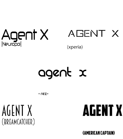
We have now completed the first edit but now we just need to find the right Typography and Font for the title and text throughout the title sequence. We have looked at various sites and sources to find these fonts such as DaFont.com and 100freefonts.com. The image shown below are some of the favourite fonts we preferred for the Spy/Action genre.

My Group and I have decided that "Xperia" and "Breamcatcher" is so far the best suited fonts but we change this when we create our final edit.


Wednesday, 3 February 2016

Action/Spy Typography

I have been looking at various Spy and Actions films and I have looked at the fonts they used in Title Sequences as well as in Posters of their films. This should help us decide a font when it comes to choosing on for our Title Sequence for "Agent X". Below are some of the images of Fonts and Typography I have found in various Spy and Action genre films.

James Bond Franchise Typography:


The modern James Bond films use very simple sans serif fonts which are either bold or thin. The thin sans serif fonts are used for the cast names in Title Sequences and the bold sans serif fonts are used for the film name title in Posters and the Title Sequences. The older James Bond Films such as GoldenEye (1995, Martin Campbell) used a Serif Font in a Gold and Red Gradient colour. For my groups title sequence "Agent X" we may decide to use sans serif fonts in just plain simple colours such as White as it looks more modern and suits our target audience.


Bourne Identity Poster Typography:


Bourne Identity also has a plain white sans serif font which is bold for the title and thin for everything else. This shows that my group and I should consider using white sans serif fonts for our title sequence as well, because the Modern James Bond films do this as well.

Mission Impossible Franchise Typography:


Mission Impossible franchise also uses Sans Serif Fonts which are in the colour white, Mission Impossible also added a black shadow effect on the background of the fonts to give a 3D look and make the fonts stand out even more.

Gathering these resources and conducting this research as helped me realise what font we need to look for in our Title Sequences. I feel we should look for white sans serif fonts as it looks very classy and high quality as well as being modern. This will help achieve interest from our target audience (British Males ages 18-29) as they are young and modern.


Saturday, 30 January 2016

Typography research GET YOUR OWN EXAMPLES!

Typography plays an important role in title sequences, it changes the audience opinion about the film and it also tells the audience what genre the film is. Titles can be serif fonts and cast names can be sans-serif fonts so the audience sees the difference and acknowledges one over the other. Some typography can be bold with solid colours and shapes, this can be related to a Saul Bass style design of typography. Some typography in title sequences have movement and they also have transitions such as fade on screen and fade off screen.

Catch Me If You Can (2002, Steven Spielberg) Typography Analysis


The fonts used in Catch Me If You Can is very simplistic sans serif fonts. It is bolded and has a solid colour of black and white. This suits the theme of the sequence which is created in Saul Bass style so it has Shapes and Solid colours like black and white.

Monsters, Inc. (2001, Pete Docter, David Silverman, Lee Unkrich) Typography Analysis


The font in Monsters, Inc. is a serif font in the colour white, the font is sharp pointed and also bold giving a monster look which suits the name and narrative of the film.


The title font is also the same but it then changes into a serif font with a bold bright blue colour and a white outline. This font again, is a Monster type of font and its also child friendly showing this is a kids/family film.

Lokking at various typography's in films has shown me that typography plays a vital role in title sequences. It immediately causes the audience to judge the film and shows them what genre the film may be or even the target audience of the film. The typography must suit the film and its genre as well as suiting the design of the title sequence.