Sunday, 31 January 2016

Spy Genre - Tittle Sequence Idea Brainstorm


My group and I have created a brainstorm of the genre we chose for our title sequence. We chose the spy genre which is a sub genre of action. We looked at ideas of the narratives and the what the name of the film may be. We have decide that the film will be about a MI6 Spy that has been framed for killing a fellow Agent, the head of MI6 framed the Spy and now wants him arrested. The spy who was framed is now on the run from the people he works for, and he is on the search of clearing his name. We have decided that we will call the film "Agent X" and now we will plan the narrative more in depth and plan how and what we will do for the actual title sequence.

We feel we can use many props, costumes and shots for a British spy film such as Guns, secret files, formal clothes - Suits and establishing shots of London.

Saturday, 30 January 2016

Typography research GET YOUR OWN EXAMPLES!

Typography plays an important role in title sequences, it changes the audience opinion about the film and it also tells the audience what genre the film is. Titles can be serif fonts and cast names can be sans-serif fonts so the audience sees the difference and acknowledges one over the other. Some typography can be bold with solid colours and shapes, this can be related to a Saul Bass style design of typography. Some typography in title sequences have movement and they also have transitions such as fade on screen and fade off screen.

Catch Me If You Can (2002, Steven Spielberg) Typography Analysis


The fonts used in Catch Me If You Can is very simplistic sans serif fonts. It is bolded and has a solid colour of black and white. This suits the theme of the sequence which is created in Saul Bass style so it has Shapes and Solid colours like black and white.

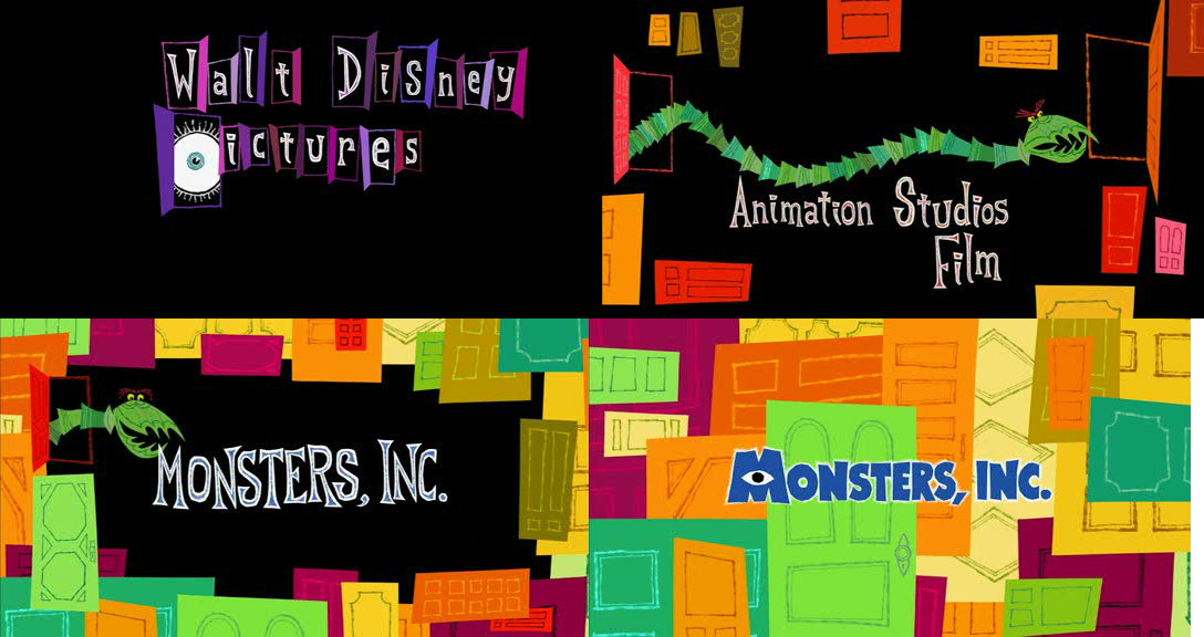
Monsters, Inc. (2001, Pete DocterDavid SilvermanLee Unkrich) Typography Analysis


The font in Monsters, Inc. is a serif font in the colour white, the font is sharp pointed and also bold giving a monster look which suits the name and narrative of the film.


The title font is also the same but it then changes into a serif font with a bold bright blue colour and a white outline. This font again, is a Monster type of font and its also child friendly showing this is a kids/family film.

Lokking at various typography's in films has shown me that typography plays a vital role in title sequences. It immediately causes the audience to judge the film and shows them what genre the film may be or even the target audience of the film. The typography must suit the film and its genre as well as suiting the design of the title sequence.

Friday, 29 January 2016

Mission Impossible: Ghost Protocol (2011, Brad Bird) Title Sequence Analysis

https://www.youtube.com/watch?v=FWmDCGBAHIY


Mission Impossible: Ghost Protocol (2011, Brad Bird) Title Sequence Analysis

Spy Genre Analysis for My Title Sequence

The title sequence starts off with the main star Tom Cruise lighting a fuse with the very iconic Mission Impossible theme tune starting in the background. The titles throughout the sequence appear as the audience move along the fuse, the typography used is a Sans Serif font in the colour white. The "Mission Impossible" text is in a fiery font hinting the theme of action. The "Ghost Protocol" font is very misty and a faded grey giving the audience the feel of a ghost or something quite mysterious. The title sequence shows the Production Company and Producers first, then it goes into the title of the film and the rest of the casts. The font for the title of the film is different to the others, it is much bolder and more attractive to the audience to make sure that they read the name of the film. 


The title sequence is put together in a montage of scenes throughout the film, giving the audience an idea of what this film is about and what genre it is, which is of course Action/Spy. The audience also sees this with the props used in the title sequence such as the fuse which is lit (symbolising an explosion), Missiles, Guns/Bullets and even fast sports cars. There are various camera scenes and angles such as close ups, long shots and cinematic/establishing shots.


The title sequence overall build up pace very quickly along with the soundtrack, creating more suspense. The soundtrack is well synchronised with the text, such as sudden increase in sound when the title appears.

I like this title sequence as its easily recognisable what the genre is and it shows what the film is about and some of the great scenes you may see throughout the film, its almost as if its a trailer which sort of bends the title sequence rules as its not meant to be seen as a trailer, this was avoided in Mission Impossible as it doesn't tell the audience what the film is fully about, it just gives hints of what its about.


The Avengers (1998, Jeremiah S. Chechik) Title Sequence Analysis

https://www.youtube.com/watch?v=1M_NrJFf5g0


The Avengers (1998, Jeremiah S. Chechik) Title Sequence Analysis

Spy Genre Analysis for My Title Sequence
This title sequence is all mainly CGI with a serif text on top. The text is fairly large and it is centred in the middle so the audience look at it. The text appears on in a spiral mirror like transition and effect and the text also fades away in that transition too. The text is silver in some cases and also black depending on the background so the audience can read the text.

The title sequence starts off with the production company, the director, the stars, the film title and then the rest of the casts and director again at the end. The title sequence has a soundtrack in the background but its a Sci-fi genre soundtrack which would make the audience think they are watching a sci-fi film.


The title sequence doesn't show many spy traits as its very simplistic and would probably not attract the audience to carry on watching the film. The text also looks very sci-fi and this shows the audience that this is mainly a sci-fi film even though its actually a comedy/spy film.
I don't like this title sequence as it was very simplistic and mainly CGI. It had no shots and therefore didn't look very appealing. 


Wednesday, 27 January 2016

(Spy Genre) Mission: Impossible: Rogue Nation (2015, Christopher McQuarrie) Title Sequence Analysis


Mission: Impossible: Rogue Nation (2015, Christopher McQuarrie) Title Sequence

Spy Genre Analysis for My Title Sequence


Skyfall (2012, Sam Mendes) Contemporary Title Sequence Analysis


Skyfall (2012, Sam Mendes) Title Sequence/Opening Scene Analysis


Spy Genre Title Sequences Analysis

The Skyfall title sequence didn't have many shots as it was all mainly created with CGI and therefore it can look interesting as the setting can be anywhere. It was also made as silhouettes which gives the mystery of who the character/spy is and what he looks like. The text was small and simple sans serif text in the colour white, this shows the text isn't the main part of this title sequence and they want the audience to watch the title sequence mainly instead of reading the text.


The colours were all very red and black giving a dark and mysterious look and also makes the audience curious about whats happening in the scenes. The audience knows its an action film as there were shots of guns, knives and blood which shots the film will have fight scenes.

The scenes started off in a slow pace with the music, but as the pace in the music builds up the speeds in the video build up and scenes change quickly. The scenes were well synchronised with the music as when the soundtrack pauses the scenes change.


I like this title sequence but I feel its very long as it mentions many cast names throughout the sequence which could bore the audience before the film even starts. Its also very simplistic and all CGI which doesn't always appeal the audience as they don't see much from the film, such as some action scenes and it also doesn't tell a lot about the film and the genre or what its about.


By Ghanshyam Shiyani

Casino Royale (2006) and Casino Royale (1967) Title Sequence Analysis

Below this the Title Sequence for Casino Royale (2006, Martin Campbell)

Below this is the title sequence for the old Casino Royale (1967, John HustonVal GuestRobert ParrishKen HughesJoseph McGrath & Richard Talmadge)

Spy Genre Analysis for My Title Sequence
Casino Royale (2006) was all very mainly done in CGI with some actual shots mixed into it, such as at the end when the character changes from silhouette to real and back to silhouette to give that mystery of who is the Spy. The font used was very simplistic sans serif in white and the first text shown was of Production companies and the stars and cast. The director was last to appear. The text at the start was centred so the audiences reads the main big names but after that the text was all placed around the sides and the faded on and off the screen. The title sequence had a soundtrack in the background which was very well synchronised with the video, such as when the gun was fired there was a drum beat with the music to give the effect of an explosion and show the audience this will be an action film.

Casino Royale (1967) had some shots within the animation and the texts. The shots also had filters on it giving it an interesting look. The whole title sequence was all text with one large first letter in Gold and the rest in  small serif fonts in the colour blue. The text fades on but then cuts off to the next text so it isn't very smooth and considering it was made around 1967 where most title sequences were just images, this is a pretty nice and simplistic title sequence with some shots of the stars and scenes from the film. The text during the end appears with the music and its very well linked together with the soundtrack in the background. The soundtrack gives a comedy feel to the film and it tells the audience this may actually be a comedy film. This title sequence doesn't giveaway much and its very boring to watch compared to modern title sequences.

I personally prefer the Casino Royale (2006) title sequence as it isn't just text, its more interesting to watch and its more likely to influence me to watch the whole film whereas with Casino Royale (1967) it was just text will some small shots on it, it wasn't very appealing compared to modern title sequences and therefore if I saw it on a film, I would most probably not watch that whole film.

Quantum of Solace (2008, Marc Forster) Title Sequence Analysis


Spy Genre Title Sequences Analysis

Quantum of Solace (2008, Marc Forster) Spy Film Title Sequence Analysis

The title sequence didn't have any camera shots at all. Like most James Bond title sequences it was all created with CGI  that worked around some shots of the actor Daniel Craig himself. It was created with CGI so the setting can be created virtually in any way the producers wanted it to look.


It was also made as silhouettes which gives the mystery of who the character/spy is and what he looks like. The text was small and simple sans serif text in the colour white, this shows the text isn't the main part of this title sequence and they want the audience to watch the title sequence mainly instead of reading the text.


The colours were all very red and black giving a dark and mysterious look and also makes the audience curious about whats happening in the scenes. The audience knows its an action film as there were shots of guns and knives which shots the film will have fight scenes.

The scenes started off in a slow pace with the music, but as the pace in the music builds up the speeds in the video build up and scenes change quickly. The scenes were well synchronised with the music as when the soundtrack pauses the scenes change.

I like this title sequence but I feel its very long as it mentions many cast names throughout the sequence. Its also very simplistic and all CGI which doesn't always appeal the audience.

Wednesday, 20 January 2016

"North by Northwest" (1959, Alfred Hitchcock) Old Spy Film Title Sequence Anlaysis


"North by Northwest" (1959, Alfred Hitchcock) Title Sequence by Saul Bass.

Spy Genre Analysis for My Title Sequence

North By Northwest is a famous film and portrayed as a great film as well. Its an action thriller film by the famous director Alfred Hitchcock.

The title sequence starts off with a green background with blue animated lines crossing the screen. This looks visually abstract and interesting and attracts the audiences attention. The suspense soundtrack in the background also builds up and it catches the ears of the attention as well as the audiences eyes as its synchronised with the scenes and the text.


The text used was Sans Serif and it was a big and bold font in a white colour. The text stands out and Saul Bass done this so the audience actually read the text. The text was also centred so its the main part of the title sequence. It also slides on the screen instead of just appearing. This makes the title sequence look more interesting and unique instead of being bland. The text was slanted along side the lines to give an effect of a wall.

The background also slowly transitions and fades into a video of a side of a building. The patterns was actually windows on a side of a building. This also looks interesting instead of just having a plain green colour in the background with lines going across it.


The title sequence mentions the title of the film, the director at the start and end and also mentions all the other main cast members. The title sequence is also continuous as it continues straight in the film as it isn't transitioned off or has a scene change.

I like this title sequence as its simple but also look very interesting and has the main feature of a title sequence. Which is mentioning the main cast members.

By Ghanshyam Shiyani

Working Title - Groundhog Day Title Sequence Remake

Working Titles - Groundhog Day (1993, Harold Ramis) Title Sequence Remake


My group and i made these images on Adobe photoshop. It shows the main parts a title sequence must have. Such as the start of a title sequence usually has the name of the production company, in this case its "Working Title". Groundhog Day is about a weatherman so I used a light blue colour to relate to the sky and the weather.


The second part of a title sequence is usually the directors name and the title of the film. As you can see this title sequence was rather like a Saul Bass style, as I was inspired by the work of Saul Bass when making this title sequence. I used a silhouette of Pennsylvania as the original Groundhog Day film was set in Pennsylvania. I centred the main title so the audience reads the name of the film and concentrates mainly on that.


Title sequences then usually mentions the main stars of the film. I used a bright white and bold font to represent a cloud with the sky blue background. I then also added a silhouette of the stars mentioned again inspired in a Saul Bass Style. 


I then mentioned the other extra credits to other main cast members. I also added images related the the role the person played in the film or related to the film itself such as the image of the groundhog animal. The bright bold Sans serif text really stands out and makes sure the audience looks at it and the images also relate to the text or the film so the audience know what the text is about or what the film is about.


At the end I again mentioned the Director as most title sequence mention the Director twice, once at the start and once at the end. I stuck with this traditional layout of a title sequence and followed the main features title sequences have. I centred the text in the middle so the audience look straight at it and read it.

By Ghanshyam Shiyani

Saturday, 16 January 2016

Insidious (2010, James Wan) Title Sequence Analysis (Horror)

Insidious (2010, James Wan) Title Sequence Analysis


The cinematography in the title sequence are close ups and long shots of scary objects such as dolls and an alley way. The shots also have a black and white filter to give an eery feel to the audience and immediately you realise this is a horror film. There are many shots and they all have this black and white filter which can also give the audience the feel of an old film or even the idea that its night and there may be ghosts.


The lighting is very low on the shots, again to give a creepy and scary feel. They also used props like a grandfather clock and a photo of a family, all iconic pops in some horror films. The soundtrack used is a scary soundtrack again to relate to the genre of the film. The soundtrack suddenly starts to increase in volume giving a scary feel to the audience and then it suddenly stops which gives another scary feel of whats going to happen. The title sequence constantly puts the audience on the edge of their seats.

The typography is very sharpe and serif fonts in the colour red to symbolise blood and evil. The text also fades in and away like smoke symbolising a ghost. The transitions are simple and they are combined with the other shots. All the shots are very quick and cut together giving the audience a hint of what the film is about and that its mainly around a house and a little boys bedroom. I like this title sequence as it suits the genre very well along with all four of the elements.

Friday, 15 January 2016

Karin Fong - Director and Designer of Title Sequences


Karin Fong - Director and Designer (Research)

Brief of Karin Fong

Karin Fong both a Director and Designer, was born in 1971 in USA.
She has won a Primetime Emmy, and nominated 4 times for a Primetime Emmy and was also recently named one of the top 100 most creative in business by Fast Company magazines. She began her career with an art degree from Yale and then onto becoming an animator on the WGBH TV program ‘Where in the world is Camen Sandiego?’.


She is now the founder and member of the Imaginary Forces, which is a production and design company based in New York. Her work has been shown at famous events such as the Cooper Hewitt National Design Museum, the Pasadena Museum of California Art, The Wexner Center, Artists Space, and the Walker Art Centre. 

She has worked with many famous films and title sequences such as :- 

Boardwalk Empire

Daredevil
The Pink Panther 2
The Terminator Salvation

Daredevil (2003, Mark Steven Johnson) Title Sequence Analysis


Karin Fong only used CGI throughout her title sequence for Daredevil (2003).
She uses bright and bold 3D fonts on a dark background making sure it stands out. She also centers the text so the audience look directly at it. The title sequence mentions the main production companies first then the stars and that’s it. It doesn’t follow the normal tradition of title sequences such as the Production Company, then director, then film name and after all that comes the stars and casts.
Fong also add various sound effects which synchronize with the actual scenes and footage, such as the sudden volume increase when the Daredevil logo appears.
I think this title sequence was fairly bland as it was all CGI and could be made better if it had some shots of actual film scenes of Daredevil the character.


Dial 'M' for Murder (1954, Alfred Hitchcock) Title Sequence Analysis


Dial 'M' for Murder (1954, Alfred Hitchcock) Opening Scene/Title Sequence Analysis


The title sequence in Dial 'M' for Murder was a very simplistic title sequence mainly because of the year it was out, 1954 which had fairly simple title sequences. The text was a serif font with a scratchy and gothic look. The font was a shade of yellow and also had a shadow on the back of it to make it stand out more and give a 3D look. The text was also big and bold as well as being centred in the middle to make sure the audience look at it and read the text.


The title sequence had a telephone as a prop in the video, the telephone links with the name of the film called 'Dial 'M' for Murder'. There was no actual main cinematography throughout this opening scene. The scenes throughout this title sequence were just a long shot image and a close up image, here was no actual video.

The title sequence also had a soundtrack in the background to make it look and sound better instead of just text fading on and off a screen.


I like this title sequence as its simple but it also looks good and has the main feature of a title sequence, which is to feature all the main cast and the title of the film. I like the large and bold text which really stand out, most title sequences have small text therefore this one stand out more.

Spy Genre Codes and Conventions

The spy genre is a sub genre of Action meaning some of the codes and conventions will be very similar. Such as:-

Guns and Weapons
Chase Scenes
Explosions
Suspense
Relationship
Fight Scene

These conventions and codes are very similar to other spy films such as James Bond and the Bourne Franchise.

Love Actually (2003, Richard Curtis) Title Sequence/Opening Scene Analysis


Love Actually (2003, Richard Curtis) Title Sequence/Opening Scene Analysis

Love actually title sequence is a very unique title sequence. It doesn't have all the features that you would see most title sequences having.

There wasn't many editing in this title sequence. There was only a couple of texts used throughout the whole title sequence. This text was just the production company, the distribution company, the association company at the start and at the end was the title, no stars or any other cast members were mentioned. This was done so the audience don't get distracted by the names and so they actually listen to the dialogue said in the background, that way the audience can understand the message for the film.


The text was small and not very bold either. The colour of the text was very bland and white and the font used was sans serif, which again is a very simplistic font. One part of the text which was "love" was in red which was used to symbolise love and it tells the audience that this gene is romance. The text was also edited in a way that it doesn't just appear on the screen. It fades on and off the screen.


It was also created like a montage which quick cuts of various scenes and shots showing the love in Heathrow airport. There were no transitions between the scenes, it just had scenes cut in. The scenes were also slowed down a bit to add an effect of love being shown. This lets the audience consume the content more in depth and truly see what this film may be about.

The cinematography was also very simplistic. There wasn't many camera positions and angles at all. Most of the shots were all mid shots. The opening scene/title sequence shows scenes of people meeting family, friends and loved ones at Heathrow Airport. all the shots used in the title sequence symbolised love.

There was a diegetic voiceover on the top of the scenes to introduce the viewers into the film and tell them a rough idea of what it may be about and it tells the audience about the romance genre of the film. The film is also a comedy but that isn't shown in the title sequence, all that is shown is the romance. There was also a non diegetic soundtrack in the background to make the opening sequence more interesting instead of it being bland.

Personally I don't like this title sequence as it doesn't have many features most title sequences should have such as the stars and the cast names. The opening scene also didn't have many texts and it didn't have any filter or effects. This title sequence could have been made more interesting instead of this simplistic look that the editors decided to go with.

By Ghanshyam Shiyani

Thursday, 14 January 2016

My Favourite Title Sequence Analysis

My favourite title sequence is the title sequence from Marvel's Daredevil TV Series (2015- Drew Goddard).


This whole title sequence is made from CGI and is very well detailed and in very high quality. Throughout this title sequence there are various cinematics, some close ups and some long shots which pan and move on a dolly track, of course these were not really filmed with a camera, these cinematics were all done with CGI. The title sequence has a non-diegetic soundtrack playing in the background and it is very well synchronised with the text and the actual visuals itself. The soundtrack has a lot of suspense and even has heartbeats which link to the storyline of blood and the devil. This shows the audience what genre this TV Show is and that it is an Action Film with a lot of blood as the whole title sequence consists of blood pouring and dripping on certain objects such as sculptures and the Daredevil Helmet. The blood also pours on various landmarks in New York and this represents the establishing shots of the TV Shows and where it is set. It even shows the religious sides of the TV Series with a CGI scene of a Church. This title sequence doesn't have any cast credits and it just has a title, so it breaks most codes and conventions of title sequences as it doesn't actually show the actor names and other casts. The title appears on the screen in a drip transition like blood and its also in the colour of dark red like blood, just like the whole title sequence. Its a little hard to see the text as its the same colour as the background but the text does have a dark shadow to it, so it stand out.

I really like this title sequence as it looks very interesting and it really tells a brief of what this TV Show is about and what genre it is.

Comparing Independent and Mainstream Title Sequences in the Spy Genre

Independent Spy/Action Genre Titles Sequence

The Raid: Redemption (2011, Gareth Evans) Production Companies involved in this film were Merantau Films, Celluloid Dreams and XYZ Films.

Legend (2015, Brian Helgeland) The main Production Company involved in this film was Working Title Films.

I have seen both these acton films and they don't have an actual title sequence which mentions the cast and and the actors, it only says the main production company and the title of the film. This tells me independent films do not concentrate on creating title sequences as they try to attract their audience mainly from word of mouth and just show the film, they don't have interest in making the start of the film interesting for the audience, they want to overall make the film interesting and appealing rather then the title sequence and the credits.

Mainstream Blockbuster Spy/Action Title Sequence

Spectre (2015, Sam Mendes), The main Production Companies involved in this film were Columbia Picture, Eon Productions, Metro Goldwyn Mayer and Sony.


The above title sequence is from Spectre, it has Non-Diegetic sound which is very well synchronised with the scenes and the text. It also has various cinematic and shots making it look very high quality along with CGI such as the octopus. This instantly makes the film appealing and tells me that my film "Agent X" and its title sequence must be by a Mainstream Blockbuster Company as it must appeal the audience and look very high quality.

Analysis of Contemporary Title Sequence and Older Title Sequences

The title sequence below is by Saul Bass and an old title sequence from the film Vertigo (1958, Alfred Hitchcock).

 This title sequence below is a more modern and contemporary title sequence from the film Se7en (1995, David Fincher)


The font used in Vertigo was serif where as in Se7en it was a sans serif hand drawn type of font to give a horror look and feel. The font fades on the screen and also slides on the screen at slow speeds in Vertigo which looked simplistic however in Se7en it sometimes fades on and also appears on instantly with a eery movement, this hints to the audience the horror/thriller genre.

Vertigo mainly had patterns in the title sequence during the end instead of having all shots like Se7en. The text also appeared in many numbers during the end whereas Se7en displayed the text one by one on black background and white fonts so that they stand out. Vertigo also had black backgrounds and white fonts to make the text visible, but Vertigo also had so many names on one scene.

The shots in Vertigo were mainly close ups just like the shots in Se7en, closes ups give a more detail which tells the audience again that the film is a thriller/horror. The soundtrack in both also suit the genre and it makes the audience enjoy the title sequence a little bit more instead of it being bland with  no sound. The sound was synchronised with the text in Vertigo, when the text appears the soundtrack has a sudden beat and increase in volume, giving emphasis to the text and to attract the audiences attention.

I prefer Se7en as it had more shots than vertigo and also a unique font instead of a simple serif font. Vertigo was very simplistically done with transitions and serif fonts along with patterns in the background. Se7en also had strange movements with the text making it look scary and had close ups shots put together like a montage and it told the background story of what the film maybe about.

Watchmen (2009, Zack Snyder) Title Sequence Analysis


Watchmen (2009, Zack Snyder) Title Sequence/Opening Scene Analysis

Editing
The text used were bold and bright yellow so that they stand out and the audience sees them. The text was also edited like it was stuck on the actual scenes so when the camera pans the text goes away with the scenes, this gives the effect that the text is actually there when the filmed, it wasn't added on. The texts also fades on the screen and transitions away when the scenes move on or when the camera angle moves.


The scenes also fade transition together with many scenes like a montage video. The quick cuts of the scenes tells the audience what genre this film maybe which is a superhero/sic-fi type of film. The scenes gave a brief outline of what the film is kinda about and the history of it.

The scenes are also darkened with low brightness and high contrast to give an old feel.


Some scenes were done as CGI such as the scene with the plane, CGI can makes the scene more enjoyable to watch as it can take the audience places where most scenes can't actually be filmed.

Mise-En-Scene
Lighting in the background of the scenes to enhance the look and quality.

Some scenes are dark as the other characters faces are hidden instead of the main character who has lighting on his face. This assures that the audience focus on the main characters facial expressions more.

Use of guns and props such as old TV's, superhero costumes, and old fashion such as suits with hats. This tells the audience what era this film may be based in and a rough idea of what it may be about.


Cinematography
Various scenes and shots such as panning, zooming in, close ups, long shots and mid shots. This make the title sequence look more interesting when the camera moves or is at different angles instead of it being in a fixed position.

Sound
Foley Sound used in the gunshots which also hints a genre of action to the audience.

There was also a non diegetic Soundtrack in the background which linked with the shots and the editing. The soundtrack told the story of the scenes to the audience and informs them that "the times are changing", showing as time goes on famous historical events will occur.

Personally I like this title sequence as it tells a breif story of what the film may be about and its also very well edited, that it is also enjoyable to watch this opening scene and it influences the viewer to watch the whole film.

By Ghanshyam Shiyani

Catch Me If You Can (2002, Steven Spielberg) Title Sequence Analysis


Catch Me If You Can (2002, Steven Spielberg) Title Sequence/Opening Scene Analysis

Editing
The editing consisted of all CGI in the style of Saul Bass which has a fixed colour on the background with black bold text or images on top. The colours used in the title sequence were bright colours and in some cases even related with the story of the film. The first colour used was a light blue relating to the sky and it tells the background story of the character being a pilot.

The text used were all black and bold so they stand out and so the audience pays attention and reads the text. The text also transitions on and off the screen making it look more visually appealing then just appearing and disappearing. The text also moves slightly which makes the audience look at it and read it.

The editing is well synchronised with the soundtrack in the background. When the soundtrack has a sudden sound there is a transition or movement in the scene.

Sound
There was a Soundtrack in the background, the soundtrack used gives a hint of the genre of the film which is a crime fiction detective film. The soundtrack makes the title sequence more appealing for the audience to watch and makes it more enjoyable.

Other Factors
The title sequence is telling a brief story of the film and the whole plot is pretty much given away in the title sequence and tells the audience what the film is about, without fully revealing the ending and some other aspects.

The title sequence involves the main names and people involved in the making of this film. The other names are mention at the ending sequence.

A good title sequence influences the audience to watch the film.

By Ghanshyam Shiyani

The Incredible Hulk (2008, Louis Leterrier)

The Incredible Hulk (2008, Louis Leterrier) - Title Sequence Analysis

http://www.artofthetitle.com/title/the-incredible-hulk/

Editing
The colours used on the text were green and bold with a black background making it stand out more. The green colour relates with the film as Hulk is green and famously known for the colour green. The text was also all entered in the middle to make sure that the audience looks at it. The text faded on the screen and also drifting away towards the audience watching, making it feel 3D and more realistic.

Editing very well synchronised with the music such as the cuts with the scenes, makes the title sequence more visually appealing to watch.

The scenes were edited in quick cuts and sort of like a montage giving a quick basic outline of what the film is about. It tries to attract the audience by showing the best scenes quickly and makes the audience want to watch the whole film to see what actually happened at that scene.

The first few scenes were edited at very high contrast and brightness, this is telling the audience that its like a flashback and tells the audience the background story before the film starts.

Mise-En-Scene
Newspapers, x-ray scans, pictures of incidents occurred and guns all used to tell the basics of the background story for the movie and it tries to interest them into watching the film. The guns tells the audience its got action scenes in the film and the newspapers and pictures tells the audience it also has a storyline behind it.

Cinematography
First person scene so the audience sees what the Hulk is seeing, makes the audience feel like they are Hulk and gets them more involved and grabs the audiences attention.

Scenes of action in the title sequence to show the audience that the film will be full of action and it will be interesting.

Sound
Pleonastic sound was used in this title sequence with the loud crashes, button clicks and rip of the shirt. It is used to interact with the audience and gives a sense of realism.

There was a Soundtrack in the background to build suspense and even sound effects to go with the editing such as "swooshing" sounds when the scene changes or when the text appears and goes. This make it sound more interesting and realistic, it improves the way the title sequence is consumed by the audience.

Article on the history of Title Sequences


This article shows the development of the art of title sequences at the start of films. From the silents films in the 1900s to the modern films produced with technology. The article displays how over time the art of title sequence has constantly changed and improved, but that doesn't mean the old title sequences styles have been forgotten. "The concept of score visualisation first conceived by Oskar Fischinger in his film “Studies” anticipates the effects created by Saul Bass in “The Man With the Golden Arm” (1955) and later by Susan Bradley in “Monsters, Inc” (2001):" This quote from the article shows that the old title sequences are still being looked at and being considered. Susan Bradley   in Monsters, Inc (2001) was inspired by the art of Saul Bass showing that even at modern times the old title sequence designs and ideas have not been forgotten.

(Monsters Inc, 2001)

(The Man With the Golden Arm, 1955)

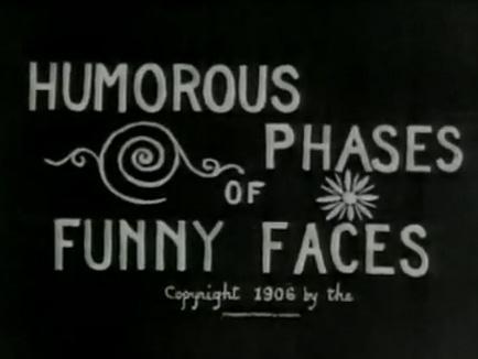
"“Humorous Phases of Funny Faces” (1906) was directed by J. Stuart Blackton, who many consider to be the father of American animation. Not only is it one of the first animated films, it is among the first to feature an animated opening title, making it a precursor of the modern title sequence" This quote shows how animated title sequences actually began. Many modern title sequences are animated especially when they are for an animated film. If it wasn't for J. Stuart Blackton many title sequences may not have been animated, J. Stuart Blackton started the era of using animation in title sequences.

Typography has been an important part of title sequences since the first title sequence ever created. Famous filmmakers such as Woody Allen strongly considered the typography in his title sequences. This quote from the article shows that Allen has a specific font he uses and prefers to use in his films. "Allen uses the Windsor font for most of his films". Woody allen also used his typography with "the very appearance of white-on-black title lettering". Even in modern films typography is strongly considered and is seen as a huge part of a title sequence. "For the end sequence of “Ratatouille”, Susan Bradley drew the typography, inspired by the slab-serif typeface. For the opening titles, she used a hand-drawn cursive intended to evoke Paris". Various films have certain types of typography which suit the genre. Some typography may be bold and some more simplistic depending on the film. The typography must look visually appealing and attract the audience.

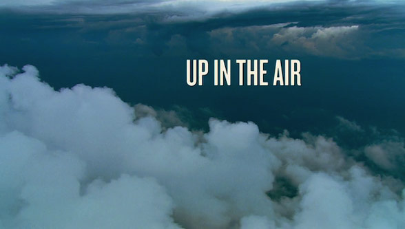
Some of the title sequences created strongly considered the camera shots used instead of just having an animated title sequence. "In the title sequence for “Up in the Air” (2009), the designers at Shadowplay Studios rely on aerial photography" This quote from the article shows that this title sequence consisted of aerial shots instead of an animated title sequence. Shadowily studios wanted to only use aerial shots in their opening scene of the film.

Graphic design has also been a huge part of title sequences in films. Mainly title sequences consider the use of graphic design to create title sequences. The famous graphic design style is of course by Saul Bass which has been used in many films. "The 2005 crime-comedy “Kiss Kiss Bang Bang”, designer Danny Yount made use of Saul Bass-style graphics to recreate the atmosphere of 1960s detective stories" and even Steven Spielbergs 'Catch Me If You Can' used graphic design inspired with a Saul Bass style.

Overall conclusion, the article linked at the start of this blog informs us of the great development in the art of title sequences. Title sequences are still developing and styles are still changing but the history of title sequences are still creating a huge impact on modern title sequences.