
This article shows the development of the art of title sequences at the start of films. From the silents films in the 1900s to the modern films produced with technology. The article displays how over time the art of title sequence has constantly changed and improved, but that doesn't mean the old title sequences styles have been forgotten. "The concept of score visualisation first conceived by Oskar Fischinger in his film “Studies” anticipates the effects created by Saul Bass in “The Man With the Golden Arm” (1955) and later by Susan Bradley in “Monsters, Inc” (2001):" This quote from the article shows that the old title sequences are still being looked at and being considered. Susan Bradley in Monsters, Inc (2001) was inspired by the art of Saul Bass showing that even at modern times the old title sequence designs and ideas have not been forgotten.


(Monsters Inc, 2001)
(The Man With the Golden Arm, 1955)
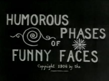 "“Humorous Phases of Funny Faces” (1906) was directed by J. Stuart Blackton, who many consider to be the father of American animation. Not only is it one of the first animated films, it is among the first to feature an animated opening title, making it a precursor of the modern title sequence" This quote shows how animated title sequences actually began. Many modern title sequences are animated especially when they are for an animated film. If it wasn't for J. Stuart Blackton many title sequences may not have been animated, J. Stuart Blackton started the era of using animation in title sequences.
Typography has been an important part of title sequences since the first title sequence ever created. Famous filmmakers such as Woody Allen strongly considered the typography in his title sequences. This quote from the article shows that Allen has a specific font he uses and prefers to use in his films. "Allen uses the Windsor font for most of his films". Woody allen also used his typography with "the very appearance of white-on-black title lettering". Even in modern films typography is strongly considered and is seen as a huge part of a title sequence. "For the end sequence of “Ratatouille”, Susan Bradley drew the typography, inspired by the slab-serif typeface. For the opening titles, she used a hand-drawn cursive intended to evoke Paris". Various films have certain types of typography which suit the genre. Some typography may be bold and some more simplistic depending on the film. The typography must look visually appealing and attract the audience.
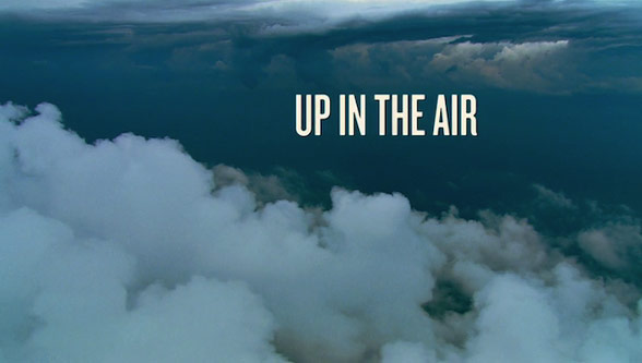 Some of the title sequences created strongly considered the camera shots used instead of just having an animated title sequence. "In the title sequence for “Up in the Air” (2009), the designers at Shadowplay Studios rely on aerial photography" This quote from the article shows that this title sequence consisted of aerial shots instead of an animated title sequence. Shadowily studios wanted to only use aerial shots in their opening scene of the film.
 Graphic design has also been a huge part of title sequences in films. Mainly title sequences consider the use of graphic design to create title sequences. The famous graphic design style is of course by Saul Bass which has been used in many films. "The 2005 crime-comedy “Kiss Kiss Bang Bang”, designer Danny Yount made use of Saul Bass-style graphics to recreate the atmosphere of 1960s detective stories" and even Steven Spielbergs 'Catch Me If You Can' used graphic design inspired with a Saul Bass style.
Overall conclusion, the article linked at the start of this blog informs us of the great development in the art of title sequences. Title sequences are still developing and styles are still changing but the history of title sequences are still creating a huge impact on modern title sequences.
No comments:
Post a Comment